Every object has properties
A property is one fact about an object: its name, its size, its colour, the text on it, whether it can be seen. The Property Inspector shows the properties of what you have selected, with friendly labels, and lets you change them by hand. xTalk reaches the same properties by their own names: you read one with the and change one with set.
- Start a new stack (File > New Stack > Default Size), or add a card to yours (Object > New Card).
- In Edit mode, drag a Standard Button to the top left of the card, and in the Property Inspector name it
Big. - Drag its bottom right corner until it is about 200 points wide and 60 high. The Property Inspector's Position section shows its Width and Height as you drag.
Now open the Message Box (Tools > Message Box) and type these lines, pressing Return after each. Watch the button change as you go:
set the textSize of button "Big" to 24
set the textStyle of button "Big" to "bold"
set the label of button "Big" to "Press me!"
put the name of button "Big"
put the label of button "Big"button "Big" Press me!
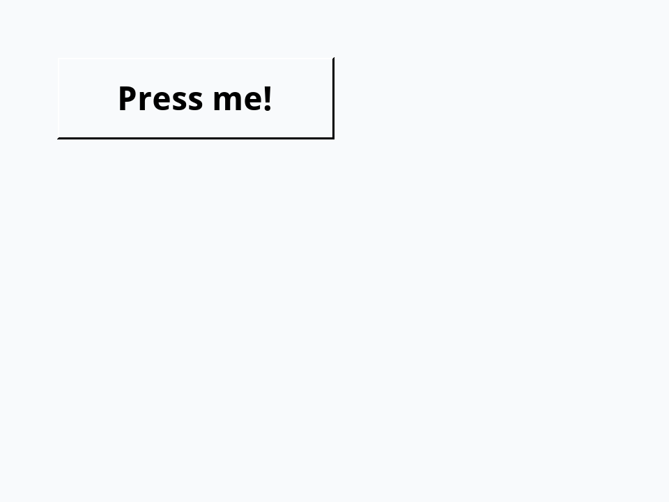
Select the button in Edit mode and the Property Inspector shows the new values too: Label in its Basic section, Text size and Text style in its Text section. The Inspector and xTalk are two doors into the same room: what you set in one, the other sees. Hold the pointer over a label in the Inspector to see the property's xTalk name.
A button's label is the text it shows; its name is what scripts call it. Keeping them apart lets you change the words on a button, or translate them, without breaking a single script.
Size and place
When you drag a control or its corners, you are changing several properties at once, and they all stay in step: change one and the others follow.
rect: left, top, right, bottomloc: the point at its centre (Location in the Inspector)widthandheightleft,top,right,bottom, and the cornerstopLeft,bottomRightand so on
- Drag a Rectangle Graphic onto a card and name it
Box. - In the Property Inspector's Position section, set its Width to 200 and its Height to 100.
- In its Colors section, set the Fill color to a light teal, and in Basic, set the Line thickness to 4.
put the width of graphic "Box" && the height of graphic "Box"
set the foregroundColor of graphic "Box" to "navy"
set the loc of graphic "Box" to 200,150
put the rect of graphic "Box"200 100 100,100,300,200

Moving the centre to 200,150 moved the whole rectangle and kept its size. (A graphic draws its line in its foregroundColor; buttons and fields use it for their text.) A rect is a list of four items, so a script can change it with chunk expressions and set it back. Drag a Standard Button to the top left of a card and name it Step:
- Drag a Standard Button to the top left corner of a card, about 100 points wide, and name it
Step.
Give it this script. me is the object whose script is running, here the button itself:
on mouseUp
   put the rect of me into tRect
   add 50 to item 1 of tRect
   add 50 to item 3 of tRect
   set the rect of me to tRect
   put the rect of me
end mouseUp60,10,160,40 110,10,210,40
Each click moves the button 50 points to the right. Back in Edit mode, drag it home again.
Colours
A colour can be a name ("orange", "navy", "darkred"), a web-style hex code ("#5FE0CF") or three numbers from 0 to 255 for red, green and blue. backgroundColor fills a control (the Inspector's Fill color), textColor colours its text, and borderColor the edge of a button or field. In the Inspector, clicking a colour opens a colour chooser.
- Drag three Rectangle Graphics onto a card, in a row, each about 100 points square.
- Name them
Square 1,Square 2andSquare 3, from left to right.
set the backgroundColor of graphic "Square 1" to 255,0,0
set the backgroundColor of graphic "Square 2" to "#5FE0CF"
set the backgroundColor of graphic "Square 3" to "gold"
put the backgroundColor of graphic "Square 1"
put the backgroundColor of graphic "Square 2"255,0,0 #5FE0CF
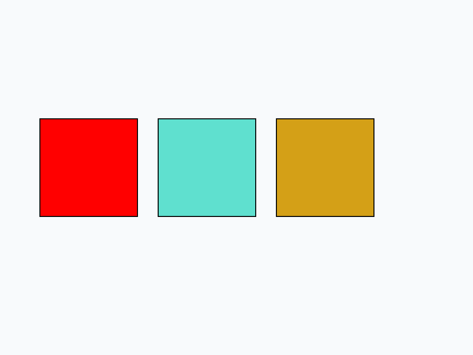
A colour reads back the way it was set: three numbers stay three numbers, and a hex code stays a hex code.
Text properties
Fields and buttons share a set of text properties, in the Inspector's Text section: textFont, textSize, textStyle (plain, bold, italic, underline and more, joined with commas) and textAlign (left, center or right), and in Colors, textColor.
- Drag a Field to the top of a card, name it
Greeting, and make it nearly as wide as the card and about 60 points high.
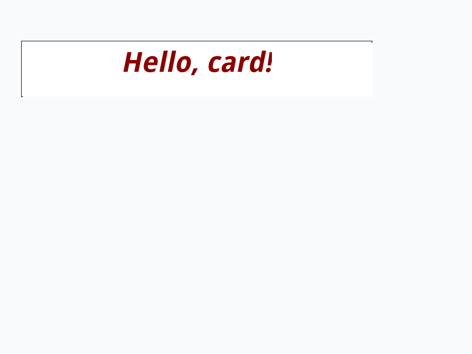
set the textSize of field "Greeting" to 28
set the textColor of field "Greeting" to "darkred"
set the textAlign of field "Greeting" to "center"
put "Hello, card!" into field "Greeting"
set the textStyle of field "Greeting" to "bold,italic"
put the textStyle of field "Greeting"bold,italic
Showing and hiding
A control's visible property says whether it shows (the Visible box in the Inspector's Basic section). hide and show are short ways to set it. A hidden control is still there, with all its properties and its script: it is only out of sight.
- Drag two Oval Graphics onto a card, side by side. Name the left one
Shownand the right oneHidden, and set the Fill color of both to royal blue. - Drag a Standard Button under them and name it
Peek.
hide graphic "Hidden"
put the visible of graphic "Shown"
put the visible of graphic "Hidden"
put the number of graphicstrue false 2
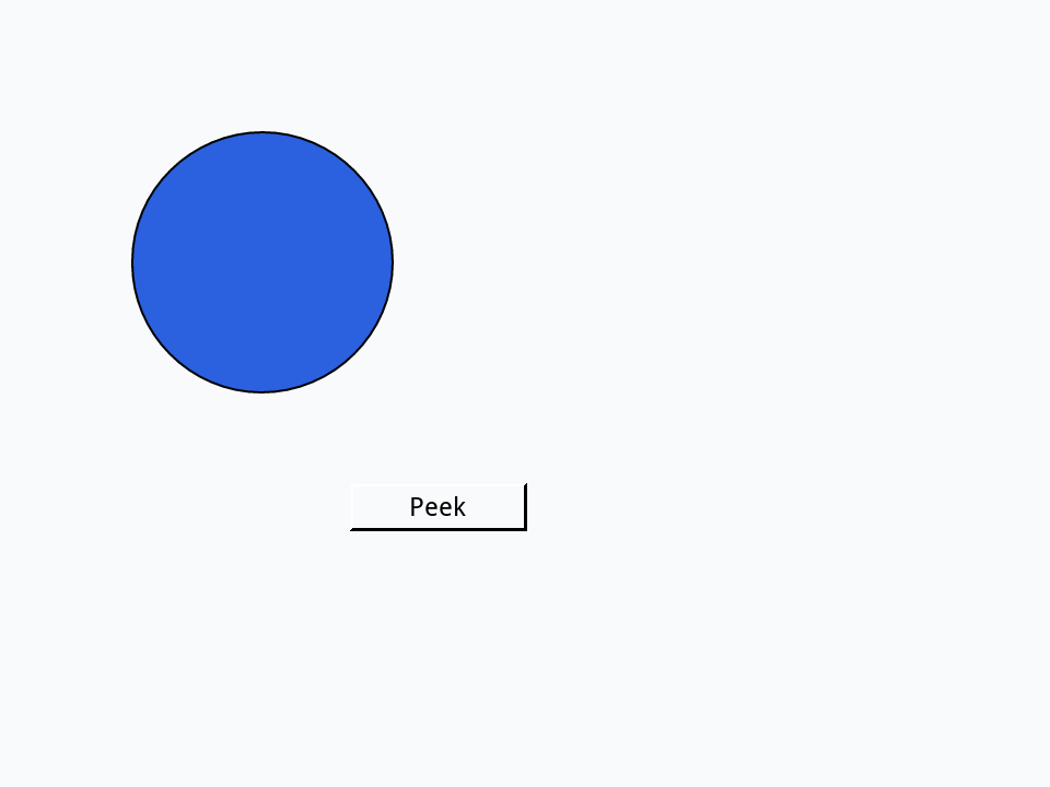
The hidden circle still counts. Now give the button Peek a script that turns the circle on and off: not turns true into false and back.
on mouseUp
   set the visible of graphic "Hidden" to not the visible of graphic "Hidden"
   put the visible of graphic "Hidden"
end mouseUpfalse true
Inherited properties
Text properties that a control leaves empty come from the object that holds it: its card, then its stack. Set the textSize of a card and every field on it follows, unless a field sets its own. the effective asks for the value the control really uses:
- Drag two Fields onto a card and name them
AandB.
set the textSize of this card to 20
set the textSize of field "B" to 12
put "[" & the textSize of field "A" & "]"
put the effective textSize of field "A"
put the effective textSize of field "B"[] 20 12
This is how a whole stack gets one font: set its textFont once, on the stack (in the Stack Inspector, Object > Stack Inspector), and leave the controls' own empty. A stack made with File > New Stack starts with a textSize of 16, which its controls use until you set one of theirs.
A misspelled property
One surprise: setting a property xTalk does not know is not an error. It quietly makes a custom property of that name, a feature the lesson Custom properties puts to good use. So a typing slip like this, on the button Big from the start of the lesson, does nothing you can see, and says nothing either:
set the lable of button "Big" to "Oops"
put "[" & the label of button "Big" & "]"
put the lable of button "Big"[] Oops
When a set seems to do nothing, check the property's spelling first. The Inspector cannot make this slip, which is one reason to use it while you learn the names.
Try it yourself
Drag a Field onto a card and name it Badge. Then, in the Message Box, make it 200 by 60 points, put its centre at the centre of the card (the loc of this card), give it a gold background and the text WINNER in bold 30-point type, centred. Last, put whether its loc is the card's. (You could do all of it in the Property Inspector too: doing it in xTalk is practice for scripts.)
- Drag a Field onto a card and name it
Badge.
Show a solution
set the width of field "Badge" to 200
set the height of field "Badge" to 60
set the loc of field "Badge" to the loc of this card
set the backgroundColor of field "Badge" to "gold"
set the textSize of field "Badge" to 30
set the textStyle of field "Badge" to "bold"
set the textAlign of field "Badge" to "center"
put "WINNER" into field "Badge"
put the loc of field "Badge" is the loc of this cardtrue

Words in this lesson
settheProperty InspectorrectlocwidthheighttopLeftlabelbackgroundColortextColorforegroundColortextSizetextStyletextAlignvisibleshowhideeffectivemeEach one finds every lesson that uses it. The Dictionary has the whole story of each, with its syntax and more examples.