The icons
OXT-Beyond comes with a few hundred icons, the ones the Header Bar, the Navigation Bar and the Tile show (Header bars, tabs and tiles). Each is a drawing written as an SVG path, a line of text that tells a pen where to go, so it stays sharp at any size. The Icon SVG library knows them all: iconNames gives their names, a line each, and iconSVGPathFromName gives the path of one:
put iconNames() into tNames
put the number of lines of tNames
put "heart" is among the lines of tNames
filter tNames with "*arrow*"
put the number of lines of tNames
put line 1 to 4 of tNames
put char 1 to 12 of iconSVGPathFromName("heart")369 true 13 arrow down arrow left arrow right arrow up M896 1664Q87
The names are in lower case, with spaces between words, such as thumbs up or circle arrow up. A name the library does not know gives an empty path. To see them all, put iconNames() in the Message Box, or look through the Icon Picker at the end of this lesson.
The SVG Icon widget
The SVG Icon widget draws one icon, as big as its rectangle. In the Property Inspector its Preset chooses the icon from a menu of them all; from a script it is the iconPresetName. Its colour is its foreColor, as for a field's text; its angle turns it, in degrees clockwise; and flipped turns it upside down. A row of weather icons, made from a script:
put "sun,cloud,umbrella,bolt,moon" into tWeather
repeat with tIndex = 1 to 5
   create widget (item tIndex of tWeather) as "com.livecode.widget.svgpath"
   set the iconPresetName of it to item tIndex of tWeather
   set the foreColor of it to "230,140,40"
   set the rect of it to 20 + (tIndex - 1) * 90, 40, 90 + (tIndex - 1) * 90, 110
end repeat
set the angle of widget "umbrella" to 45
put the number of widgets
put the iconPresetName of widget "cloud"5 cloud
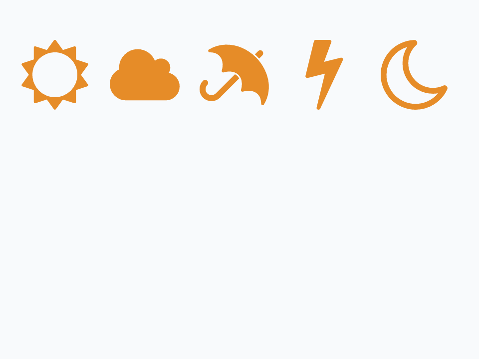
An icon keeps its shape when its widget is stretched, as big as fits and in the middle, so a wide SVG Icon draws a cloud no wider than a square one.
A shape of your own
The iconPath is the drawing itself, and it can be one of your own. An SVG path is a list of commands, each a letter and then numbers: M moves the pen to a point without drawing, L draws a straight line to a point, and Z draws back to the start and closes the shape. Points are across and then down, as on a card, so this house starts at the top of its roof:
put "M 50 0 L 100 45 L 85 45 L 85 100 L 15 100 L 15 45 L 0 45 Z" into tHouse
create widget "House" as "com.livecode.widget.svgpath"
set the rect of it to 20, 40, 160, 180
set the iconPath of it to tHouse
set the foreColor of it to "60,160,110"
create widget "Wide" as "com.livecode.widget.svgpath"
set the rect of it to 190, 40, 470, 180
set the maintainAspectRatio of it to false
set the iconPath of it to tHouse
set the foreColor of it to "60,160,110"
put the scaledWidth of widget "House", the scaledHeight of widget "House"
put the scaledWidth of widget "Wide", the scaledHeight of widget "Wide"140,140 280,140
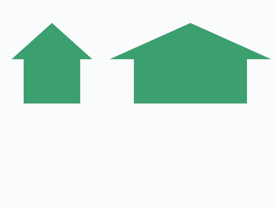
The numbers only have to be right among themselves: the widget scales the drawing to fit. With maintainAspectRatio false it fills the widget instead, stretched as the widget is; scaledWidth and scaledHeight say how big the drawing came out. SVG paths have curves too, and any drawing program that saves SVG makes them.
To use a shape of your own by name, as the icons that come with OXT-Beyond are used, give it to the library with addIcon, its name, its path, and an empty third value, which matters only to icon fonts:
addIcon "house", "M 50 0 L 100 45 L 85 45 L 85 100 L 15 100 L 15 45 L 0 45 Z", empty
put char 1 to 6 of iconSVGPathFromName("house")
put "custom" is among the lines of iconFamilies()
create widget "Home" as "com.livecode.widget.svgpath"
set the iconPresetName of it to "custom/house"
put the iconName of widget "Home"M 50 0 true custom/house
Icons you add go in a family of their own named custom, apart from the fontawesome family the others are in, and a name can say which family it means, as custom/house does. A widget that takes an icon's name, such as a Tile or a Navigation Bar, can then use it too. The library forgets the icons you add when OXT-Beyond quits, so a stack that uses one adds it each time it opens, in preOpenStack.
A button that lights
An SVG Icon sends mouseUp when it is clicked, so it can be a button. Its highlight draws it in its hiliteColor instead of its foreColor, which suits a button that stays on, such as a heart for liking something. Build a card with one:
- Make a new stack, or go to an empty card. In Edit mode, drag an SVG Icon from the widgets of the Tools palette to the card, make it about 100 pixels square, and name it
Like. - In the Property Inspector, choose heart empty as its Preset, and a red as its Hilite color.
Put this in the SVG Icon's script. Each click lights it or puts it out, and shows a full heart while it is lit:
on mouseUp
   set the highlight of me to not the highlight of me
   if the highlight of me then
      set the iconPresetName of me to "heart"
   else
      set the iconPresetName of me to "heart empty"
   end if
end mouseUp
Click it in Run mode, or send it the message from the Message Box:
send "mouseUp" to widget "Like"
put the highlight of widget "Like"
put the iconName of widget "Like"
send "mouseUp" to widget "Like"
put the highlight of widget "Like"
send "mouseUp" to widget "Like"true heart false

The Icon Picker
The Icon Picker shows the icons in a grid to scroll through, and lets people choose one with a click, which sets its selectedIcon and sends mouseUp. A second click on the chosen icon unchooses it, and leaves selectedIcon empty. Its filterString shows only the icons whose names contain it. Build a card with one:
- Make a new stack, or go to an empty card. In Edit mode, drag an Icon Picker from the widgets of the Tools palette to the left of the card, make it about 300 pixels square, and name it
Picker. - Drag an SVG Icon to the right of it, make it about 120 pixels square, and name it
Preview.
Put this in the Icon Picker's script, so the Preview shows each icon that is chosen:
on mouseUp
   if the selectedIcon of me is not empty then
      set the iconPresetName of widget "Preview" to the selectedIcon of me
   end if
end mouseUpset the filterString of widget "Picker" to "arrow"
set the selectedIcon of widget "Picker" to "circle arrow up"
send "mouseUp" to widget "Picker"
put the selectedIcon of widget "Picker"
put the iconName of widget "Preview"circle arrow up circle arrow up
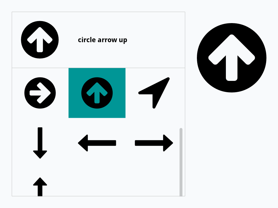
Setting selectedIcon from a script sends nothing, so the example sends the mouseUp a click would. An Icon Picker can also appear only when it is wanted, as a menu does: popup widget "com.livecode.widget.iconpicker" at the mouseLoc shows one under the pointer, waits for a choice, and puts the icon's name in the result, or empty when the choice was abandoned.
Try it yourself
Write a command showIcons that takes a word and makes an SVG Icon for every icon whose name contains it, in rows of six across the card, each named after its icon.
Show a solution
command showIcons pWord
   local tNames, tName, tCount, tLeft, tTop
   put iconNames() into tNames
   filter tNames with "*" & pWord & "*"
   put 0 into tCount
   repeat for each line tName in tNames
      put 20 + (tCount mod 6) * 75 into tLeft
      put 20 + (tCount div 6) * 75 into tTop
      create widget tName as "com.livecode.widget.svgpath"
      set the iconPresetName of it to tName
      set the rect of it to tLeft, tTop, tLeft + 55, tTop + 55
      add 1 to tCount
   end repeat
end showIcons

showIcons "arrow"
put the number of widgets
put the short name of widget 113 arrow down
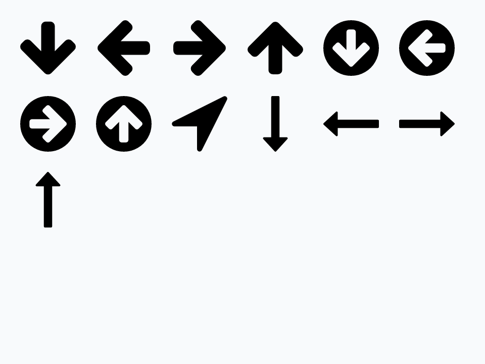
Words in this lesson
SVG IconSVG pathiconPresetNameiconNameiconPathforeColorhiliteColorhighlightangleflippedmaintainAspectRatioscaledWidthIcon SVG libraryiconNamesiconSVGPathFromNameiconFamiliesaddIconIcon PickerselectedIconfilterStringpopup widgetEach one finds every lesson that uses it. The Dictionary has the whole story of each, with its syntax and more examples.