An app's card
Most apps on a phone look alike for a reason: a bar across the top with the page's title and a button or two, a row of tabs across the bottom to move between pages, and the page itself between them. People know where to look. Three widgets make this layout, and they work on a desktop just as well. Build the card:
- Make a new stack, or go to an empty card. In Edit mode, drag a Header Bar from the widgets of the Tools palette to the top of the card, stretch it from edge to edge, and name it
Header. - Drag a Navigation Bar to the bottom of the card, stretch it from edge to edge too, and name it
Tabs. - Drag a classic Field into the space between them and name it
Page.
Each bar comes with items to show what it can do: the Header Bar says Title, with a back arrow and a plus, and the Navigation Bar has four tabs with an icon each. They are set in the Property Inspector, or from a script, as properties: a list of names for scripts, of labels for people, and of icons, each a name from the icon library that comes with OXT-Beyond (Icons and SVG). The Header Bar's title is its label:
put the itemNames of widget "Tabs"
put the itemLabels of widget "Tabs"
put the itemIcons of widget "Tabs"
put the hilitedItemName of widget "Tabs"
set the label of widget "Header" to "Contacts"contacts,favourites,music,search Contacts,Favourites,Music,Search user,star empty,music,search contacts
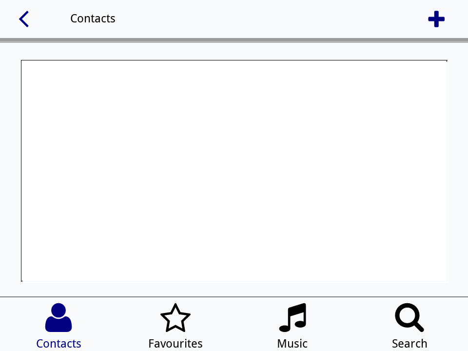
The three lists go together, item by item: to make the tabs your own, set all three, such as the itemNames to home,search,favourites,settings, the itemLabels to Home,Search,Favourites,Settings and the itemIcons to home,search,heart,cog, as the Try it yourself at the end does. itemStyle chooses what a tab shows: icons, names (the labels) or both.
Tabs: the Navigation Bar
One tab of a Navigation Bar is always lit, the page the reader is on. A click on another lights it and sends hiliteChanged, as setting its hilitedItem does; hilitedItemName says which. In a real app each tab would go to a card of its own (Cards and navigation), with the bars in a group shown on every card. Here one field stands in for the pages. Put this in the Navigation Bar's script:
on hiliteChanged
   put the hilitedItemName of me into tPage
   put "This is the" && tPage && "page." into field "Page"
   set the label of widget "Header" to item (the hilitedItem of me) of the itemLabels of me
end hiliteChangedset the hilitedItem of widget "Tabs" to 3
wait 0 milliseconds with messages
put field "Page"
put the label of widget "Header"This is the music page. Music
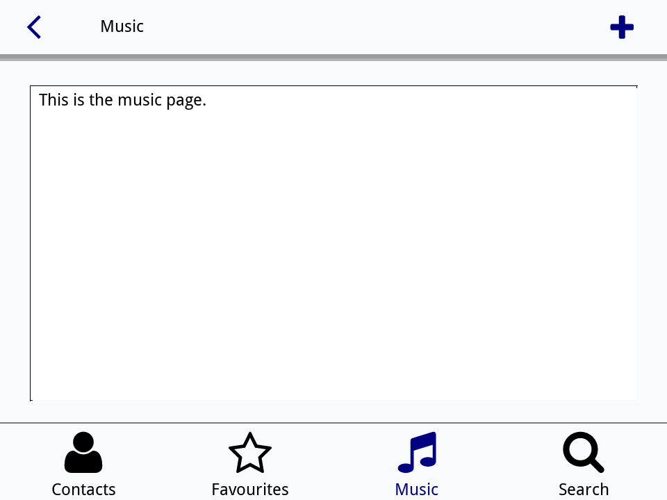
As with the Segmented Control (Switches, choices and colours), the widget sends its message once the script that changed it is done, so the wait lets it through before the next line looks. In Run mode, click a tab and watch the title change.
Actions: the Header Bar
A Header Bar's items are actions, small buttons at its ends, such as Back and Add. A click anywhere on the bar sends it mouseUp, and its mouseAction is the name of the action under the pointer, or empty when the click was on the title. Put this in the Header Bar's script:
on mouseUp
   switch the mouseAction of me
      case "back"
         go back
         break
      case "add"
         ask "What would you like to add?"
         if it is not empty then put return & it after field "Page"
         break
   end switch
end mouseUp
The actions' names and icons are lists, as the tabs' are: set the itemNames to back,add and the itemIcons to angle left,plus for the two it starts with. The first action sits at the left when firstItemLeft is true, as a back arrow should.
Tiles
A Tile is a square button with a big icon and a title, the kind of thing a home screen or a settings page shows in a grid. It lights up when the pointer is over it, and sends mouseUp when clicked. Tiles are easy to make by the dozen from a script (Making controls from a script), as here; from the Tools palette each is dragged and set like any widget:
put "Photos,camera;Music,music;Books,book;Settings,cog;Friends,user;Saved,heart" into tTiles
put "52,120,200;220,80,90;60,160,110;110,110,130;230,140,40;150,80,190" into tColours
repeat with tIndex = 1 to 6
   set the itemDelimiter to ";"
   put item tIndex of tTiles into tTile
   put item tIndex of tColours into tColour
   set the itemDelimiter to comma
   create widget (item 1 of tTile) as "com.livecode.widget.tile"
   set the tileLabel of it to item 1 of tTile
   set the iconName of it to item 2 of tTile
   set the bgColor of it to tColour
   set the fgColor of it to "255,255,255"
   put 30 + ((tIndex - 1) mod 3) * 145 into tLeft
   put 30 + ((tIndex - 1) div 3) * 155 into tTop
   set the rect of it to tLeft, tTop, tLeft + 130, tTop + 130
end repeat
put the number of widgets
put the iconName of widget "Books"6 book
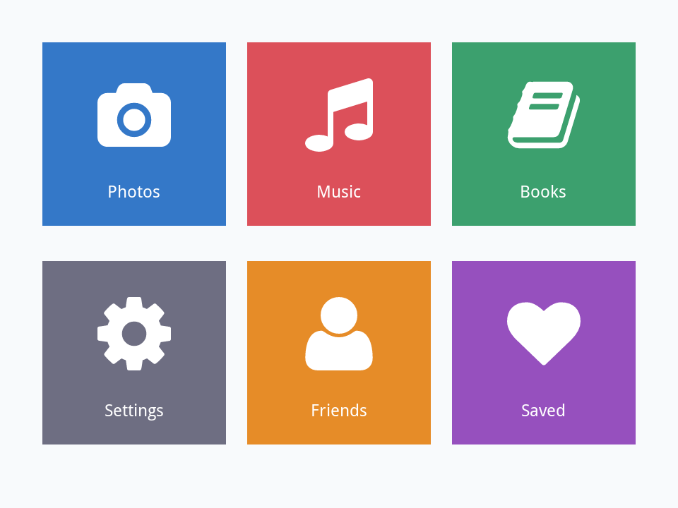
A single mouseUp handler in the card's script can answer them all, since a message a tile does not handle goes on to its card: the short name of the target says which was clicked.
Palette Actions
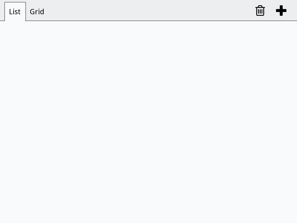
The IDE's own palettes, such as the Project Browser, have a bar of small icon buttons along their top; it is the Palette Actions widget, and it is in the Tools palette for your own palettes too. It has two sets of items: nav items on the left, of which one is chosen, like tabs, and action items on the right, like buttons. The nav items show their labels, or their icons when showNavIcons is true. Choosing one sends navSelected or actionSelected with its name:
create widget "Bar" as "com.livecode.widget.paletteactions"
set the rect of it to 0, 0, 480, 34
set the navNames of it to "list,grid"
set the navIcons of it to "list,th"
set the navLabels of it to "List,Grid"
set the actionNames of it to "add,delete"
set the actionIcons of it to "plus,trash"
set the selectedNavItem of it to "list"
put the navNames of widget "Bar"
put the selectedNavItem of widget "Bar"list,grid list
Try it yourself
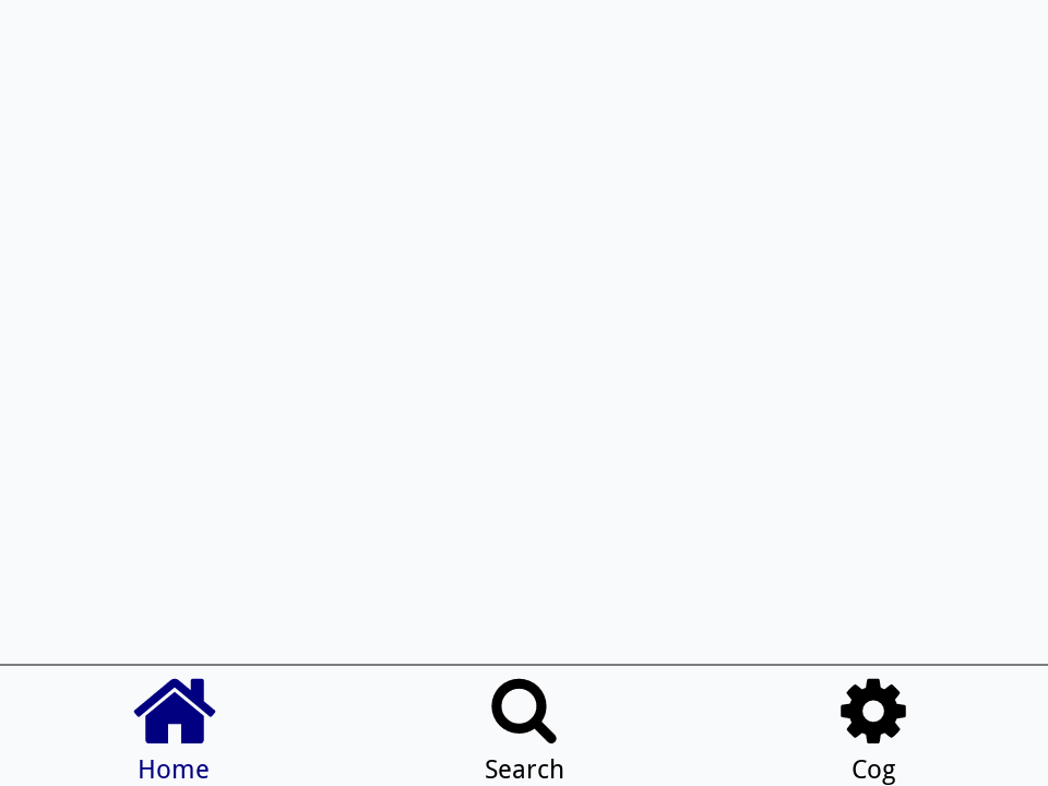
Write a command makeTabs that takes a widget name and a list of tab names, such as "home,search,cog", and makes a Navigation Bar across the bottom of the card with those tabs, each using its name as its icon and, with a capital first letter, as its label.
Show a solution
command makeTabs pName, pTabs
   local tLabels, tTab
   repeat for each item tTab in pTabs
      put toUpper(char 1 of tTab) & char 2 to -1 of tTab & comma after tLabels
   end repeat
   create widget pName as "com.livecode.widget.navbar"
   set the itemNames of it to pTabs
   set the itemLabels of it to char 1 to -2 of tLabels
   set the itemIcons of it to pTabs
   set the hilitedItem of it to 1
   set the rect of it to 0, the height of this card - 56, the width of this card, the height of this card
end makeTabs

makeTabs "Tabs", "home,search,cog"
put the itemLabels of widget "Tabs"Home,Search,Cog
Words in this lesson
Header BarlabelitemNamesitemLabelsitemIconsmouseActionNavigation BarhilitedItemhilitedItemNamehiliteChangedTiletileLabeliconNamePalette ActionsactionNamesactionSelectedEach one finds every lesson that uses it. The Dictionary has the whole story of each, with its syntax and more examples.