A button of every kind
The Tools palette has a tile for each common kind of button: Standard Button, Rectangle Button, Default Button, Check Box, Radio Button, and the menus, Option Menu, Pulldown Menu, Combo Box, Popup Menu and Tab Panel. They are all the same kind of object, a button, and its style property (Style in the Inspector's Basic section) decides what it is: change the style and a push button becomes a checkbox.
- On a new card, drag a Standard Button, a Rectangle Button, a Check Box and a Radio Button into a column, each about 180 points wide.
- Name them
standard,rectangle,checkboxandradio.
put the style of button "rectangle"
put the style of button "radio"
create button "roundrect"
set the style of it to "roundrect"
set the rect of it to 40,212,220,244
put the number of buttonsrectangle radiobutton 5
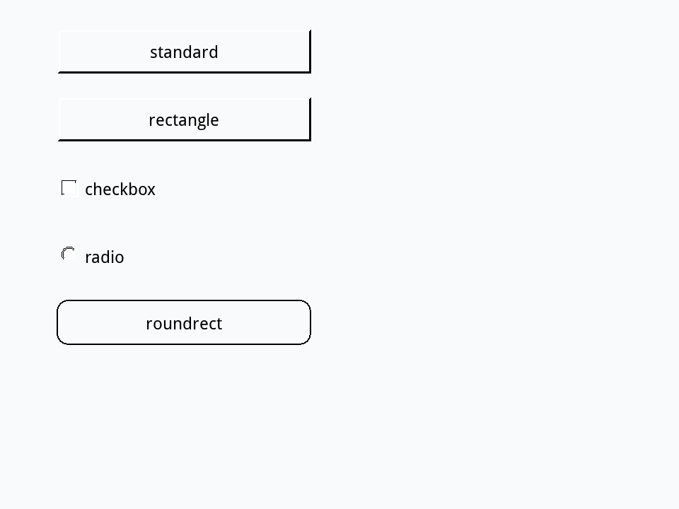
A style reads back in lower case, whichever way it was written: radioButton and radiobutton are the same style. The last lines make a button style the palette has no tile for: a rounded one. You could make it by hand too, from a Standard Button, by choosing roundrect as its Style in the Inspector.
Check boxes and hilite
A check box is on or off, and its hilite says which. Clicking it in Run mode turns it on and off by itself (its autoHilite is true), and a script can read or set it.
- On a new card, drag two Check Boxes, one under the other, and make each about 280 points wide.
- Name them
Send me the newsletterandRemember me. The name is what a check box shows beside its box.
Give the first one this script, and click it three times in Run mode:
on mouseUp
   put the hilite of me
end mouseUptrue false true
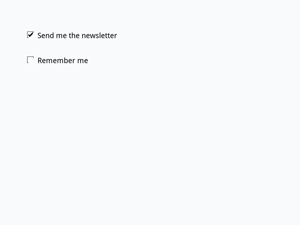
By the time mouseUp arrives, the box has already changed, so the handler sees the new state. A script sets it the same way:
put the hilite of button "Remember me"
set the hilite of button "Remember me" to true
put the hilite of button "Remember me"false true
Radio buttons
Radio buttons offer a choice of one. Put them in a group whose radioBehavior is true (the Inspector's Hilite one radio button at a time, which a new group has already): choosing one then un-chooses the others, and the group's hilitedButtonName says which is on.
- On a new card, drag three Radio Buttons into a column, and name them
Small,MediumandLarge. - Select all three and choose Object > Group Selected. With the group selected, name it
Sizein the Property Inspector.
One handler in the group's script hears every radio button in it. Give it this one, then click Medium and then Large:
on mouseUp
   put the hilitedButtonName of me
end mouseUpMedium Large
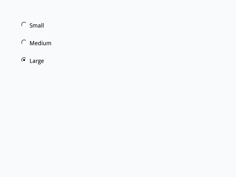
set the hilitedButtonName of group "Size" to "Small"
put the hilite of button "Small"
put the hilite of button "Large"true false
Buttons that are menus
A button with the style menu shows a menu, and its menuMode says which kind: option (a pop-up list that shows the choice), comboBox (a list you can also type into), pulldown, popup and tabbed. The lines of the button's text are the menu's items: the Inspector calls them Menu Items.
- On a new card, drag an Option Menu and name it
Colour. - In the Property Inspector's Basic section, replace its Menu Items,
Choice 1toChoice 3, withRed,GreenandBlue, a line each.
set the menuHistory of button "Colour" to 2
put the label of button "Colour"
put the menuHistory of button "Colour"Green 2
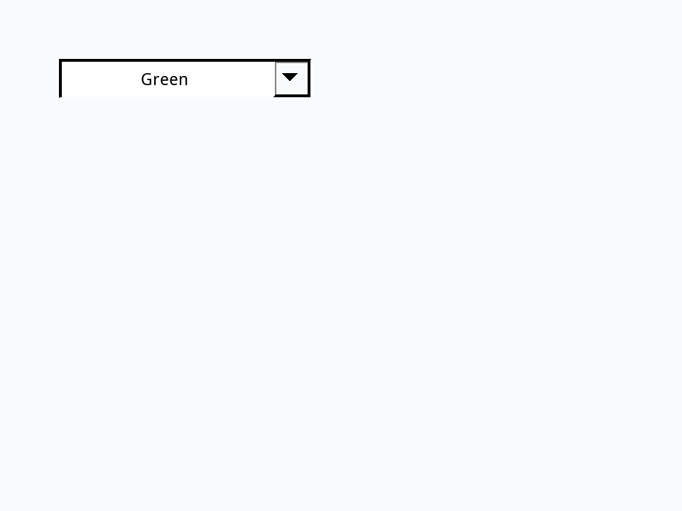
the menuHistory is the number of the chosen item, and the button's label shows its text. Until something is chosen the label still says Choice 1, from the palette.
Answering a choice: menuPick
When the user picks an item, the button gets the message menuPick, with the item's text as its parameter. Give the menu Colour this script, and in Run mode choose Blue:
on menuPick pItem
   put "You picked" && pItem
end menuPick
Setting the menuHistory from a script sends menuPick too, as if the user had chosen:
set the menuHistory of button "Colour" to 3You picked Blue
A menu's script usually has one menuPick handler with a switch on pItem, one case for each item.
Tabs
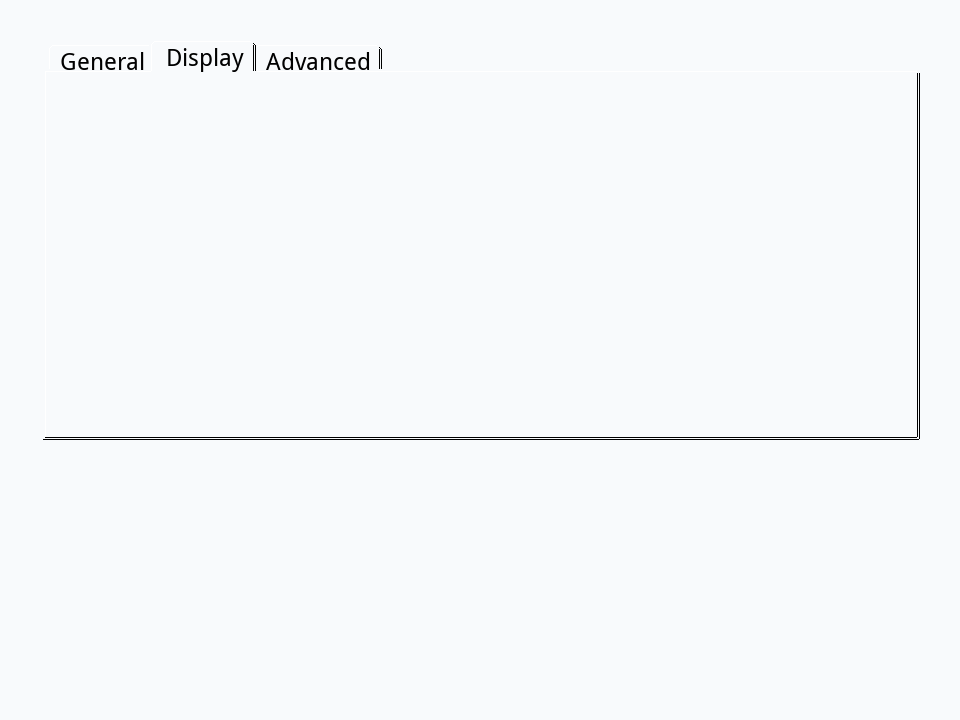
The palette's Tab Panel is a button whose menuMode is tabbed: it draws a row of tabs, one for each line of its text. Picking one sends menuPick, and the script shows the controls that belong to that tab (often a group for each) and hides the others.
- On a new card, drag a Tab Panel, make it nearly as big as the card, and name it
Settings. - Replace its Menu Items,
Tab 1toTab 3, withGeneral,DisplayandAdvanced.
set the menuHistory of button "Settings" to 2
put line (the menuHistory of button "Settings") of the text of button "Settings"Display
Enabled, disabled and default
A button that cannot be used right now should say so: set its enabled to false (or disable it, or tick Disabled in the Inspector) and it greys out and ignores clicks. The default button of a dialog, the one Return presses, is drawn with a heavier outline on some systems: the palette's Default Button is a Standard Button with default already true.
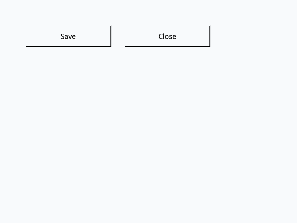
- On a new card, drag two Standard Buttons side by side and name them
SaveandClose.
set the enabled of button "Save" to false
put the enabled of button "Save"
enable button "Save"
disable button "Save"
put the disabled of button "Save"false true
Try it yourself
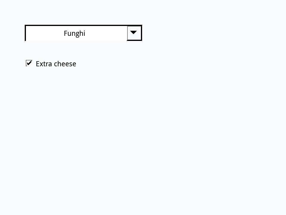
On a new card, drag an Option Menu named Pizza with the items Margherita, Funghi and Diavola, and a Check Box named Extra cheese. Write a menuPick handler for the menu that puts the order, such as Funghi with extra cheese when the box is ticked. Then tick the box, and pick Funghi.
- Drag an Option Menu, about 200 points wide, name it
Pizza, and make its Menu ItemsMargherita,FunghiandDiavola. - Drag a Check Box under it, about 200 points wide, and name it
Extra cheese.
Show a solution
on menuPick pItem
   if the hilite of button "Extra cheese" then
      put pItem && "with extra cheese"
   else
      put pItem
   end if
end menuPick
To try it from the Message Box instead of the mouse:
set the hilite of button "Extra cheese" to true
set the menuHistory of button "Pizza" to 2Funghi with extra cheese
Words in this lesson
buttonstylehilitecheckboxradioButtonradioBehaviorhilitedButtonNamemenuModemenuHistorymenuPicklabelenableddefaultCheck BoxRadio ButtonOption MenuTab PanelEach one finds every lesson that uses it. The Dictionary has the whole story of each, with its syntax and more examples.